What makes a good builder website.
We have built around ten builder websites in the last two years, each one better than the last. This is what we have learned about why most builder sites let the builder down, and what actually works.
A builder’s website has one job: to hold up under research. Homeowners planning a serious build research for months before they ring anyone, and by the time they make contact the shortlist is already written. Your website is where you either survive that scrutiny or quietly fall off the list.
The signals that scare people off
No about page. No photos of the team. No projects. No proof. That is the pattern on most builder websites, and it reads as dated, cheap and one man band, whatever the workmanship says. It costs you the referrals you never hear about. Imagine an architect who rates your work but hesitates to recommend you, because their client will land on your site and wonder who they are dealing with. That happens more than anyone admits.
A good website cannot carry bad imagery
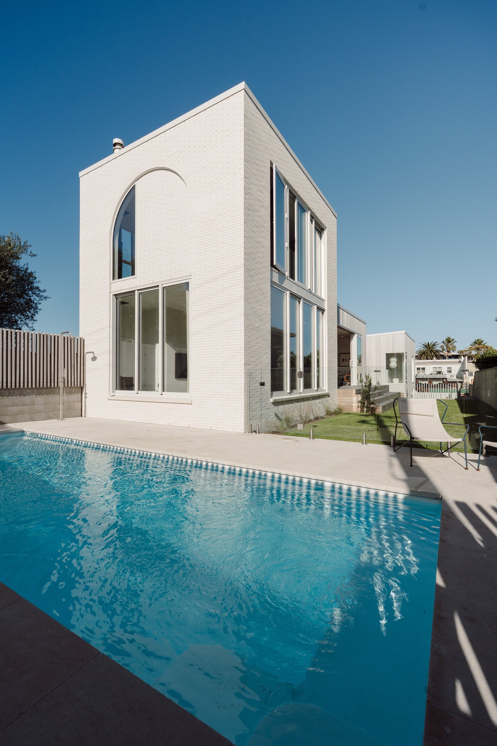
You can have a beautifully designed site and fill it with AI renders or stock photography, and it turns people off straight away. The reverse is true too: strong content props up an average site. The two are not separable, which is why we build the website and shoot the content as one package. Real projects, a real team, a hero film of your actual builds.
Why we build on Webflow and Framer
You can build a great website on plenty of platforms. We use Webflow for most builds and Framer for the simpler ones, because they are the Apple of website design: what the high end agencies build on, proven for years, fast, and simple enough for a client to make small changes without breaking anything. We do not test our clients’ websites on unproven platforms.
AI made websites cheaper. That is the trap.
We use AI right through our process, for early design directions, copy drafts and building out sections, and it has made builds faster and sharper on price. But cheap AI websites all look the same. You can get one anywhere, you can even make one yourself, and it will look like everybody else’s. The value is in the time a cheap build skips: the details that make a site unmistakably yours, and a layout that works on the phone in a homeowner’s hand, not just on the agency projector.
It should be yours
Some agencies hold websites hostage. They keep the accounts, charge heavily for small updates, and make leaving expensive. We think that is weird. We build the site, hand it over, and you invite us in as guests to keep working on it. Your website and your accounts, from day one.
What it looks like in practice
Stewart Construction had a site that had quietly died, full of old imagery they could not even access. The new one is minimal, design heavy and unmistakably theirs, and it is already outperforming the old site. Now we are watching how people actually use it and building out what they go looking for. Gardo Group came to us with a very small site, so we built the structure properly: service pages, projects, components that scale. The feedback since has been about the things that matter, traffic and leads.
Both took the shape we recommend: a proper chat about goals first, then a working homepage in the real design language, then the rest of the site built to match. A month at the quick end, generally a couple. The last details are worth not rushing.